Move a Block to a Different Region on Mobile Layouts in Drupal
Thanks to CSS3 Media Queries web developers can create a completely different layout for their websites when viewed on small screens. Drupal offers a lot of mobile first, responsive themes such as Omega, Adaptive Theme and Zen that do just this. However, there are circumstances when using responsive design is just not enough. When a user is viewing a website on a small screen, their experience is drastically different than that of a desktop user. Because of this, it might be necessary to move, replace, or even completely hide elements on the page.
In this tutorial I will show how to change a block’s positions for a mobile layout. Since this applies to responsive website, I’m going to be using the Bootstrap theme.
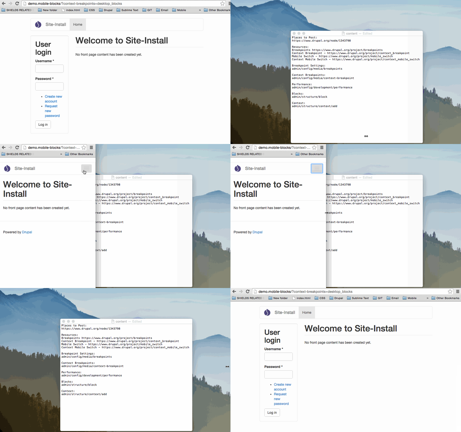
The login block will appear in the sidebar for desktop users.
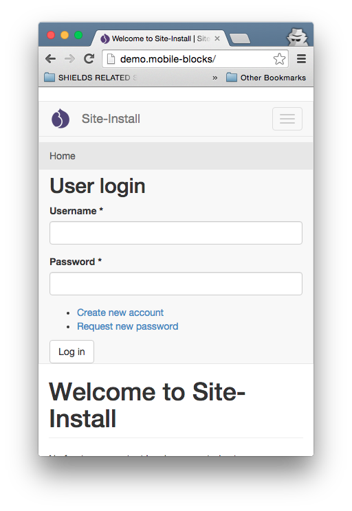
The login block will appear in the navigation for mobile users.
Configure Breakpoint
- First we will need to install Breakpoint.
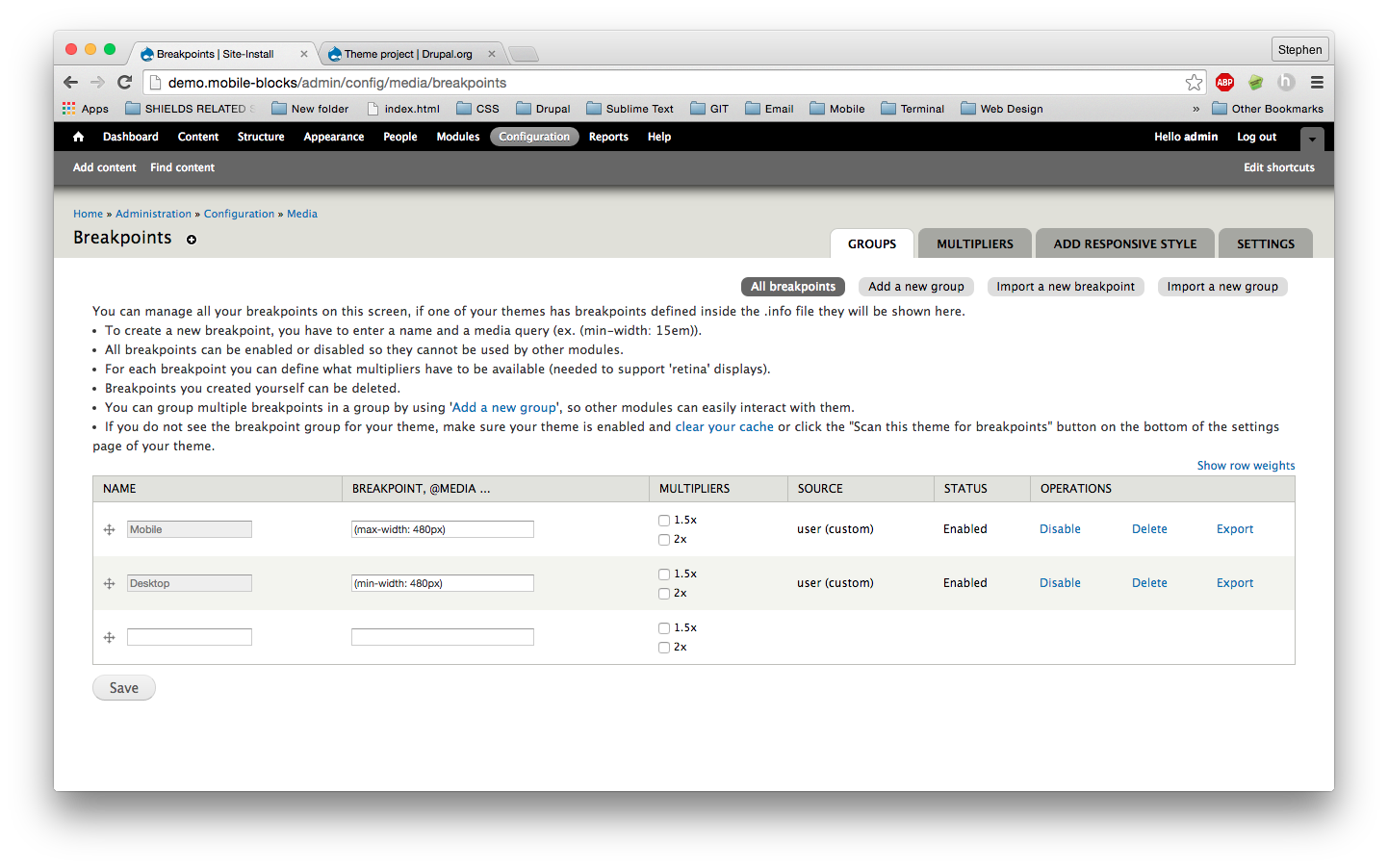
- Once installed, navigate to the settings page at admin/config/media/breakpoints. The following configuration is just an example. You can use breakpoints that best fit your theme.
- Add a breakpiont for mobile screens called Mobile and set it to (max-width: 480px)
- Add a breakpiont for desktop screens called Desktop and set it to (min-width: 481px)
 Click to expand
Configure Your Site’s Performance
Context Breakpoint has caching limitations as documented here. However, there are a few work arounds. Performance is a very important issue when it comes to web development, so make sure you enable Cache pages for anonymous users and Cache blocks.
Configure Context Breakpoint
Because we enabled page caching on our site, any block in a context breakpoint context will not appear. However, there is a solution.
- Now install and enable Context Breakpoint.
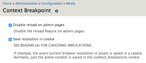
- Navigate to admin/config/media/context-breakpoint and configure the following.
- Check Disable reload on admin pages
- Check Save resolution in cookie
 Click to expand
Configure Blocks
Navigate to admin/structure/block and disable the block(s) you wish to cahnge regions. For this tutorial, I disabled the User login block.
Create Context
Now we’re going to create the context that will change the block’s position on a mobile device.
- Navigate to admin/structure/context/add and create a mobile context.
- Call the context mobile_blocks
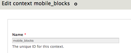 Click to expand
- Add a Breakpoint Condition and set it to the mobile breakpoint we created earlier.
 Click to expand
- Add a Blocks reaction and add place your block into your region of choice.
 Click to expand
- Call the context mobile_blocks
- Navigate to admin/structure/context/add and create a desktop context.
- Call the context desktop_blocks
 Click to expand
- Add a Breakpoint Condition and set it to the desktop breakpoint we created earlier.
 Click to expand
- Add a Blocks reaction and add place your block into your region of choice.
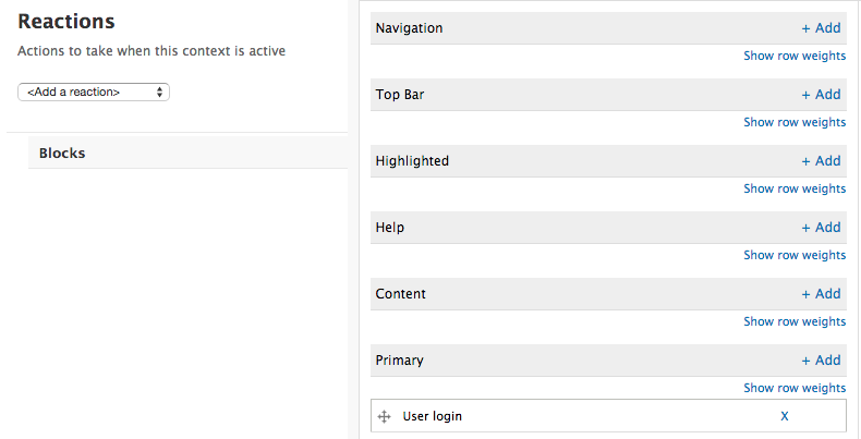 Click to expand
- Call the context desktop_blocks
- If you simply wish to display a block on desktop and not mobile or visa versa, just don’t create a context for that breakpoint. You can also use this method to display new blocks at different breakpoints as well.
Optional: Avoid Caching Issues
The above steps will allow you to change a block’s position based the user’s browser size. However, there are caching limitations as we discussed. If a user were to resize their browser to the mobile breakpoint size, the block would not change regions. This is because their initial browser size is being stored in a cookie. This isn’t necessarily a huge problem however, since it’s unlikely a user would need a mobile experience on their desktop. However, if you have a breakpoint that occurs at a larger size, it might be important to force the new layout.
Just a word of warning, the following steps are experimental. They will alter your site’s URL structure, and should be used with caution. I also noticed that once I enabled, EXPERIMENTAL: Add active contexts to url for CACHING, and later disabled it, site breakpoints stopped all together. I needed to disable and re-enable Breakpoints and Context Breakpoint to be able to go back to my original configuration.
- Navigate back to the context breakpoints configuration page admin/config/media/context-breakpoint
- Enable EXPERIMENTAL: Add active contexts to url for CACHING
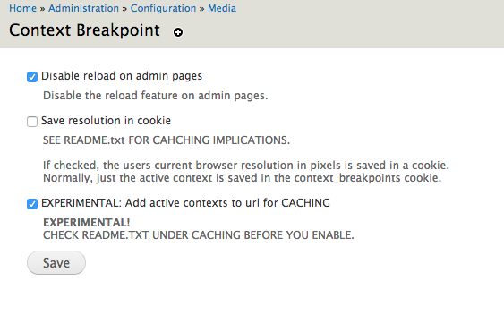 Click to expand
- Enable EXPERIMENTAL: Add active contexts to url for CACHING
- Navigate back to the context breakpoints we created earlier.
- Enable Auto-reload under the Breakpoint settings for each context.
 Click to expand
- Enable Auto-reload under the Breakpoint settings for each context.
After that, the layout will change automatically with caching enabled. However, the URL structure has been altered.


