Modern WordPress Theme Development in 2019
In this article I’m going to show you my personal and opinionated WordPress theme development workflow. The goal of this article is to highlight the power of the WordPress Command Line when combined with automated build tools, along with an organized project structure.
0. Install the WordPress Command Line
The WordPress Command Line is a Command line interface for WordPress. Simply put, this means that it can automate many tasks for us. One task is generating a starter theme. However, it can do much, much more.
1. Use the WordPress Command Line To Generate a New Starter Theme
Once you’ve installed the CLI, follow these steps to generate a base theme.
- In the root of your WordPress install, run
wp scaffold _s slug_for_your_theme --activate. For the case of this tutorial, I will runwp scaffold _s demo-theme --activate.- The wp scaffold _s function generates starter code for a theme based on _s (Underscores).
- The Underscores Theme is created by Automatic, which is the same company that brings us WordPress. By default, it generates all files and directories needed for a valid WordPress theme.
- Note that you can manually download the Underscores Theme, but using the CLI is much more effective.
If you navigate to the front end of your website, you should notice an underwhelming theme.
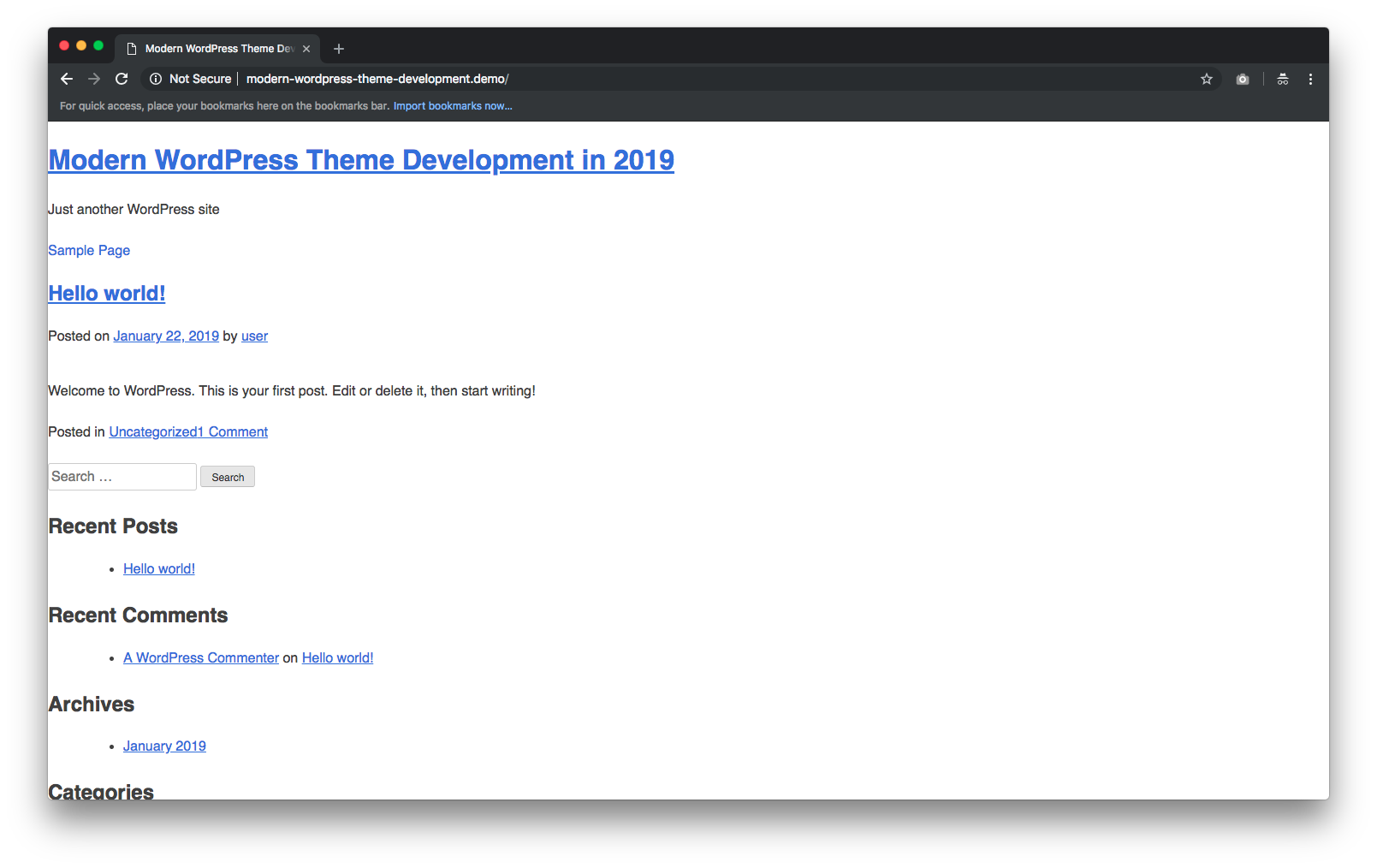
As underwhelming as it is, this starter theme meets all of WordPress’s theme development standards. In short, this means that all the necessary templates, functions and css are generated for you.
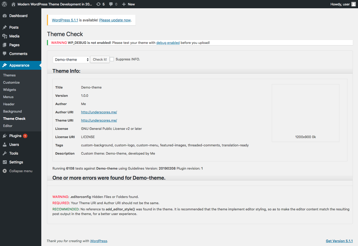
If you were to run your theme against the Theme Check plugin and its 6,108 tests, you’ll only get 2 warnings. One is about a hidden file that is generated, and the other is about changing the Theme URI and Author URI. However, these only matter if you plan on publishing your theme to WordPress.
I like to run my theme against Theme Check throughout the development process to ensure any changes I make still meet WordPress’s theme development standards.
At this point you could start editing the style.css and template files to build your custom theme. However, it’s much more effective to use modern build tools to speed up development.
2. Install and Configure WPGulp
Now that we have a base theme configured, we’ll want it to be customized with our own CSS, JS and template files. Using a build tool like WPGulp helps speed up this process.
WPGulp is an advanced & extensively documented Gulp.js + WordPress workflow. It can help you kick-start a build-workflow for your WordPress plugins and themes with Gulp.js, save you a lot of grunt work time, follow the DRY (Don’t Repeat Yourself) principle, and #0CJS Zero-config JavaScript startup but still configurable via wpgulp.config.js file…
You can read about all of what WPGulp does, but some of my favorite features are…
- Hot reloading
- ES6 compiling
- SASS compiling
- Automatic image minification
- Compiles all JS and CSS into one file each
- Follow the docs to install WPGulp.
- In my case I
cdinto my theme by runningcd wp-content/themes/demo-theme/. - I then run
npx wpgulp.
- In my case I
- Once installation is complete, you’ll want to edit the
wpgulp.config.jsfile.- Change the
projectURL: 'wpgulp.local'variable to match your local development URL. - If you plan on translating your site, make sure to update the translation options.
- Change the
3. Update Your Theme’s File Structure To Work With WPGulp
Now that WPGulp is installed and configured, we’ll want to update our theme’s file structure to match the recommendations in the wpgulp.config.js. These updates are based on the styleSRC, jsVendorSRC, jsCustomSRC and imgSRC variables.
- Assuming you’re still in your theme’s directory, run the following commands.
mkdir -p assets/css assets/js/vendor assets/js/custom assets/img/raw
- Now that the file structure matches the
wpgulp.config.jsconfiguration, we’ll want to move existing.cssand.jsfiles by running the following commands.-
mv style.css assets/css/style.scss- This moves the theme’s
style.cssfile into theassets/css, and also changes it to a.scssfile.
- This moves the theme’s
-
mv layouts/ assets/css/layouts- This moves the theme’s generated
layoutdirectory intoassets/css/
- This moves the theme’s generated
mv assets/css/layouts/sidebar-content.css assets/css/layouts/sidebar-content.scss-
mv assets/css/layouts/content-sidebar.css assets/css/layouts/content-sidebar.scss- These commands change the
.cssfiles into.scssfiles. - Note that these are boilerplate layout files generated by the
wp scaffold _scommand, and that they were never loaded into the theme in the first place. If you want to use one of them, you’ll need to import it into thestyles.scssfile. I personally never use them.
- These commands change the
mv js/customizer.js assets/js/custom/customizer.jsmv js/navigation.js assets/js/custom/navigation.jsmv js/skip-link-focus-fix.js assets/js/custom/skip-link-focus-fix.js-
rm -R js/- These commands simply move existing javascript files generated by the
wp scaffold _scommand into the new javascript directory.
- These commands simply move existing javascript files generated by the
-
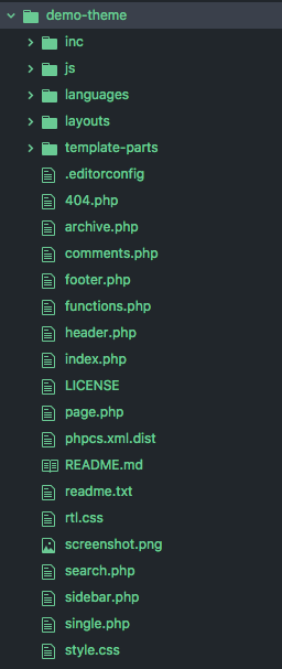
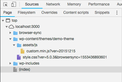
At this point your assets directory should look like this.

4. Update functions.php
Now that the assets directory is configured, we’ll need to update the theme’s functions.php file.
-
Open up your theme’s
functions.phpfile and scroll down to the Enqueue scripts and styles. section. It should look something like this./** * Enqueue scripts and styles. */ function demo_theme_scripts() { wp_enqueue_style("demo-theme-style", get_stylesheet_uri()); wp_enqueue_script( "demo-theme-navigation", get_template_directory_uri() . "/js/navigation.js", [], "20151215", true ); wp_enqueue_script( "demo-theme-skip-link-focus-fix", get_template_directory_uri() . "/js/skip-link-focus-fix.js", [], "20151215", true ); if (is_singular() && comments_open() && get_option("thread_comments")) { wp_enqueue_script("comment-reply"); } } add_action("wp_enqueue_scripts", "demo_theme_scripts");WPGulp will concatenate all javascript files in the
assets/js/customandassets/js/vendordirectories into one file each. This means that we don’t need to individually loadnavigation.jsandskip-link-focus-fix.jsanymore. Note that these files were generated by thewp scaffold _scommand, and aren’t required for every WordPress theme. -
remove the existing
wp_enqueue_scriptfunctions and replace with the following.- i’ve commented out the vendor scripts, since we currently have none. i just wanted to highlight how you would load them.
- i added
'customize-preview'as an argument to thewp_enqueue_scriptfunction for the custom-scripts. this is because the/assets/js/custom/customizer.jsfile generated by thewp scaffold _sis only loaded on the theme customizer page. - i chose to load the
.minversions of each file, but you can load the unminified versions if you wish. - the
vendor.min.jsandcustom.min.jsfiles will be generated once we run wpgulp.
      /**
       * enqueue scripts and styles.
       */
      function demo_theme_scripts()
      {
        wp_enqueue_style("demo-theme-style", get_stylesheet_uri());

        // vendor scripts. only uncomment if you have files in assets/js/vendor
        // wp_enqueue_script( 'demo-theme-vendor-scripts', get_template_directory_uri() . '/assets/js/vendor.min.js', array(), '20151215', true );
        // custom demo_theme_scripts
        // note that we pass 'customize-preview' into the array();
        wp_enqueue_script(
          "demo-theme-custom-scripts",
          get_template_directory_uri() . "/assets/js/custom.min.js",
          ["customize-preview"],
          "20151215",
          true
        );

        if (is_singular() && comments_open() && get_option("thread_comments")) {
          wp_enqueue_script("comment-reply");
        }
      }
      add_action("wp_enqueue_scripts", "demo_theme_scripts");
- Run
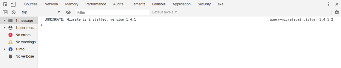
npm startto make sure everything is working. You should be able to open up http://localhost:3000/ and see your site. To ensure everything is hooked up, I temporarily added* { border: 1px solid red; }to/assets/css/style.scss. You should see the new styles load instantly in the browser.
- I also recommend checking the sources and console tabs on Chrome’s developer tools to ensure there are no errors, and that all files are being loaded.
At this point you have everything you need to start creating a custom WordPress theme using modern developer tools. In the next sections I will show you my opinionated setup.
5. Create a CSS Architecture
This next step details my opinionated set up when it comes to my CSS Architecture. I subscribe to the SMACSS way of architecting my CSS, along with the BEM naming convention. This may seem like an obsolete way of doing things if you’re coming from a frontend framework or library like React, Vue, Angular etc. However, WordPress isn’t a frontend framework, so paradigms like CSS Modules or Styled Components don’t apply.
At the end of the day, we’re compiling many
.scssfiles into one.cssfile. Using SMACSS is an excellent way to stay organized and efficient.
- Assuming you’re in your theme’s directory, run the following commands:
-
mkdir -p assets/css/base assets/css/layouts assets/css/module -
touch assets/css/base/_base.scss assets/css/base/_var.scss- This creates two new partials. One for storing SASS variables, and the other for base styles.
- Copy everything from
/assets/css/style.scssand into/assets/css/base/_base.scss - Remove everything from
/assets/css/style.scssand replace with the following:
// base
@import "./base/var";
@import "./base/base";
If you run npm start you should notice no changes. This is because we didn’t change any css, but instead broke it into partials. From here on out you’ll import your partials into style.scss.
6. Add a Typography System
Now that we’ve set up an architecture for our CSS, I like to add a typography system to the theme. I use typebase.css because of its simplicity, and use of SASS variables.
- Assuming you’re in your theme’s directory, run the following commands:
touch assets/css/base/_typography.scss
-
Open
/assets/css/style.scssand look for the Typography section. It should start look something like this:body, button, input, select, optgroup, textarea { color: #404040; font-family: sans-serif; font-size: 16px; font-size: 1rem; line-height: 1.5; } h1, h2, h3, h4, h5, h6 { clear: both; } -
Remove the typography css from
style.scss. For me this is between lines 389 and 455 - The reason we remove the default typography styles provided by the Underscores Theme is because we will be using typebase.css instead. 4. Open up_typography.scssand paste in the contents from the typebase.scss file. However, don’t paste in the Typesetting variables. We will place these in theassets/css/base/_var.scssfile instead.html { font-family: serif; font-size: $baseFontSize / 16 100%; // Make everything look a little nicer in webkit -webkit-font-smoothing: antialiased; // -webkit-text-size-adjust: auto // -moz-text-size-adjust: auto // -ms-text-size-adjust: auto // -o-text-size-adjust: auto // text-size-adjust: auto } p { line-height: $leading; margin-top: $leading; margin-bottom: 0; } ul, ol { margin-top: $leading; margin-bottom: $leading; li { line-height: $leading; } ul, ol { margin-top: 0; margin-bottom: 0; } } blockquote { line-height: $leading; margin-top: $leading; margin-bottom: $leading; } h1, h2, h3, h4, h5, h6 { font-family: sans-serif; margin-top: $leading; margin-bottom: 0; line-height: $leading; } h1 { font-size: 3 _ $scale _ 1rem; line-height: 3 _ $leading; margin-top: 2 _ $leading; } h2 { font-size: 2 _ $scale _ 1rem; line-height: 2 _ $leading; margin-top: 2 _ $leading; } h3 { font-size: 1 _ $scale _ 1rem; } h4 { font-size: $scale / 2 _ 1rem; } h5 { font-size: $scale / 3 _ 1rem; } h6 { font-size: $scale / 4 _ 1rem; } table { margin-top: $leading; border-spacing: 0px; border-collapse: collapse; } td, th { padding: 0; line-height: $baseLineHeight _ $baseFontSize - 0px; } code { // Forces text to constrain to the line-height. Not ideal, but works. vertical-align: bottom; } .lead { font-size: $scale _ 1rem; } .hug { margin-top: 0; } -
Open up
assets/css/base/_var.scssand paste in the Typesetting variables from typebase.scss file].// Typesetting variables. Edit here or override in main file prior to import of this. $baseFontSize: 22 !default; // in pixels. This would result in 22px on desktop $baseLineHeight: 1.5 !default; // how large the line height is as a multiple of font size $leading: $baseLineHeight \* 1rem !default; // Rate of growth for headings // I actually like this to be slightly smaller then the leading. Makes for tight headings. $scale: 1.414 !default; -
Finally, import
/assets/css/base/_typograhpy.scssinto/assets/css/style.scss// base @import "./base/var"; @import "./base/base"; @import "./base/typography";
If you run npm start and open your browser, you should see something like this.
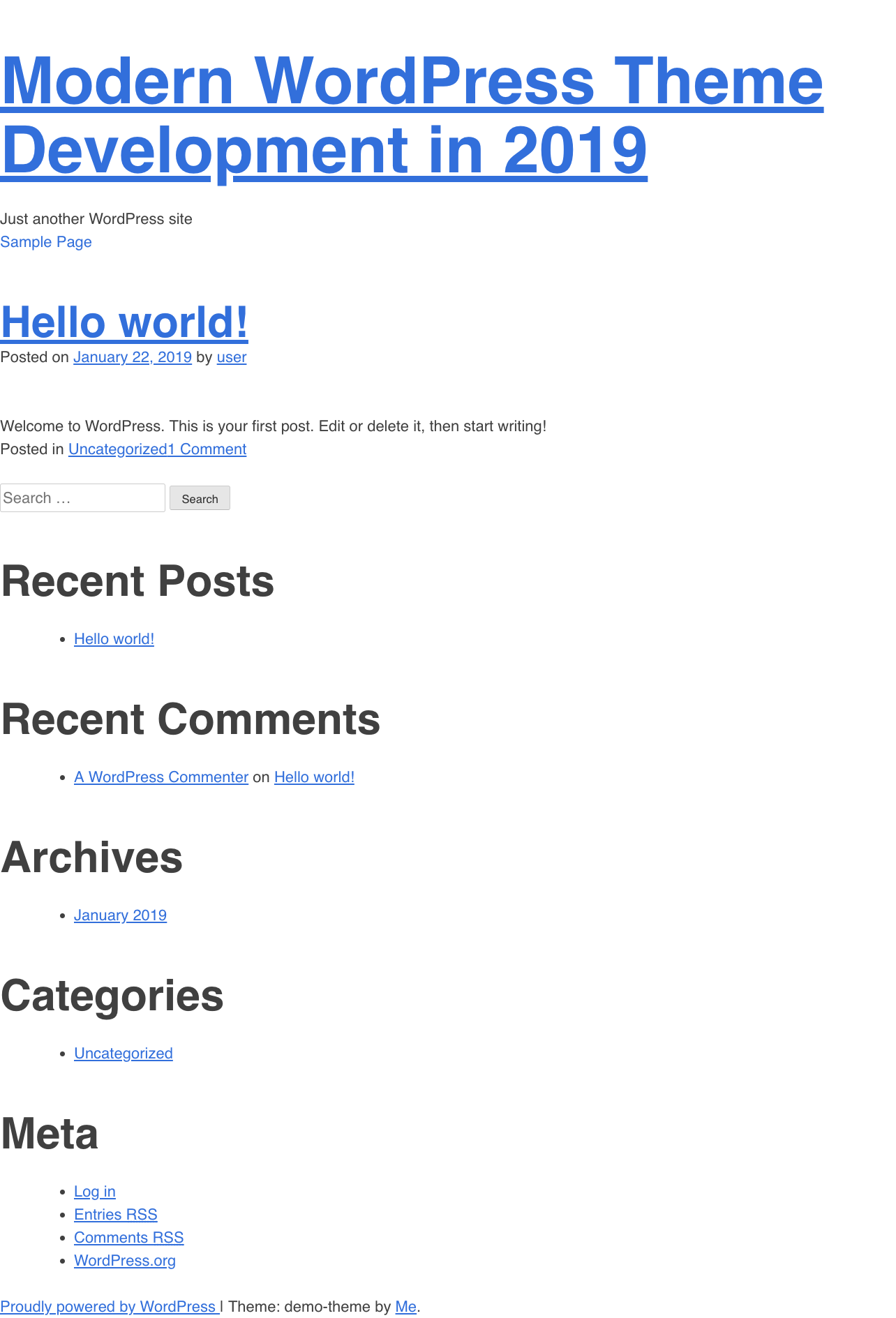
The default size is usually too big for me, so I set $baseFontSize:22 !default; to 16 instead.
7. Add a Grid System
Next I like to add a grid system to my theme. Some argue that this is unnecessary because of CSS Grid, but I’ve found that having a simple grid system is very helpful.
I highly recommend using Semantic UI Container and Semantic UI Grid because of its easy naming conventions and use of flex-box instead of floats.
- First, we need to remove the default layout files that were generated and updated in steps 3.2.2 through 3.2.4. Assuming you’re still in your theme’s directory, run
rm assets/css/layouts/sidebar-content.scss assets/css/layouts/content-sidebar.scss. - Run
touch assets/css/layouts/_container.scss. - Copy the contents from container.css and paste into
/assets/css/layouts/_container.scss. - Run
touch assets/css/layouts/_grid.scss. - Copy the contents from grid.css and paste into
/assets/css/layouts/_grid.scss. -
Open up
/assets/css/base/_var.scssand add the following SASS variables:- These are the breakpoints defined in the Semantic UI Container. Adding these breakpoints as variables is useful when writing custom media queries for your theme.
// Typesetting variables. Edit here or override in main file prior to import of this. $baseFontSize: 16 !default; // in pixels. This would result in 22px on desktop $baseLineHeight: 1.5 !default; // how large the line height is as a multiple of font size $leading: $baseLineHeight \* 1rem !default; // Rate of growth for headings // I actually like this to be slightly smaller then the leading. Makes for tight headings. $scale: 1.414 !default; // breakpoints // from device width https://semantic-ui.com/elements/container.html $bp--sm: 768px; $bp--md: 992px; $bp--lg: 1200px; -
Finally, import
assets/css/layouts/_container.scssandassets/css/layouts/_grid.scssinto/assets/css/style.scss.// base @import "./base/var"; @import "./base/base"; @import "./base/typography"; // layouts @import "./layouts/container"; @import "./layouts/grid";
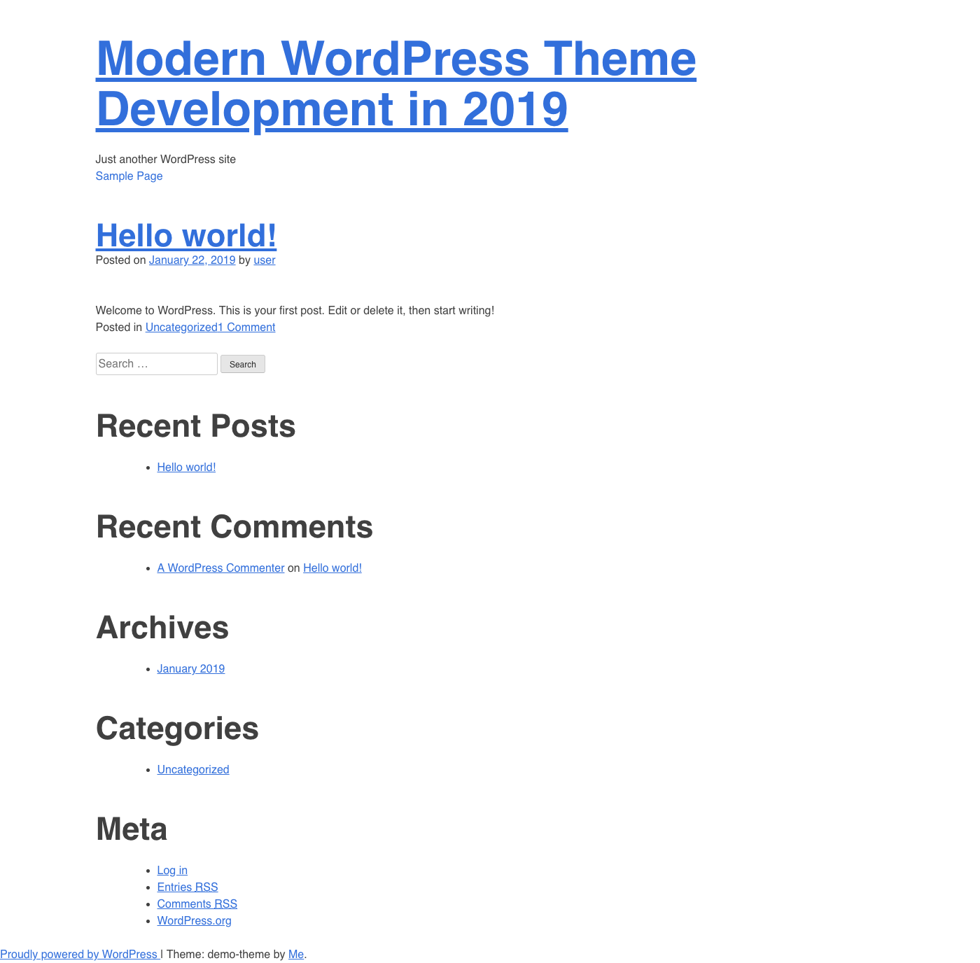
As a test, add .ui.container classes to the #masthead and #content in wp-content/themes/demo-theme/header.php.
<?php
/**
 * The header for our theme
 *
 * This is the template that displays all of the <head> section and everything up until <div id="content">
 *
 * @link https://developer.wordpress.org/themes/basics/template-files/#template-partials
 *
 * @package Demo-theme
 */
?>
<!doctype html>
<html <?php language_attributes(); ?>>
<head>
<meta charset="<?php bloginfo("charset"); ?>">
<meta name="viewport" content="width=device-width, initial-scale=1">
<link rel="profile" href="https://gmpg.org/xfn/11">

    <?php wp_head(); ?>

</head>

<body <?php body_class(); ?>>
<div id="page" class="site">
<a class="skip-link screen-reader-text" href="#content"><?php esc_html_e(
  "Skip to content",
  "demo-theme"
); ?></a>

    <header id="masthead" class="site-header ui container">
    <div class="site-branding">
    <?php
    the_custom_logo();
    if (is_front_page() && is_home()): ?>
    <h1 class="site-title"><a href="<?php echo esc_url(
      home_url("/")
    ); ?>" rel="home"><?php bloginfo("name"); ?></a></h1>
    <?php else: ?>
    <p class="site-title"><a href="<?php echo esc_url(
      home_url("/")
    ); ?>" rel="home"><?php bloginfo("name"); ?></a></p>
    <?php endif;
    $demo_theme_description = get_bloginfo("description", "display");
    if ($demo_theme_description || is_customize_preview()): ?>
    <p class="site-description"><?php echo $demo_theme_description;
      /* WPCS: xss ok. */
      ?></p>
    <?php endif;
    ?>
    </div><!-- .site-branding -->

    <nav id="site-navigation" class="main-navigation">
    <button class="menu-toggle" aria-controls="primary-menu" aria-expanded="false"><?php esc_html_e(
      "Primary Menu",
      "demo-theme"
    ); ?></button>
    <?php wp_nav_menu([
      "theme_location" => "menu-1",
      "menu_id" => "primary-menu",
    ]); ?>
    </nav><!-- #site-navigation -->
    </header><!-- #masthead -->

    <div id="content" class="site-content ui container">
The content should now have a max width
Conclusion and Next Steps
Regardless of what the design looks like, I start every custom WordPress theme with the above steps. From there I add color variables, and begin to style the header and footer first. I always populate the site with dummy data so that I can style each unique page template, and account for edge cases.